Wednesday 2 May 2012

Evaluation of Portfolio.

Our Trailer as a Real Media Device

As a rule our trailer followed the typical conventions of a horror genre, but we also challenged these by using a female protagonist. We would liken our trailer to films such as Friday the 13th or Sorority Row as they include a psychological twist which we wanted to feature in our trailer.We used the conventions of titles including our production company and most of our transitions followed the conventional pattern of either fades to black or white. However our trailer used black and white which is unconventional. We used it to show action that happened in the past and differentiate this with the present. We also sped up and slowed down a few scenes to create tension, which is stereotypical of horror film trailers but not necessarily all. We have also used a darker setting and several possible villains to create a sense of disorientation, both of which are stereotypical to the genre we tried to portray, psychological thriller.
                  We have used conventions of all trailers such as fades to black/white between shots, titles including the generic black and red colour scheme and darker settings for films of a horror genre. We followed the repetoire of elements set up by Branston and Stafford, we looked at stereotypical horror settings such as forests and lakes, used darker lighting to create a sense of danger and carried through 2 iconic images of a black hood, linking to death and the lake representing both danger and safety thus giving a false sense of security. We also used red herring effect to create confusion, conforming to another convention of psychological thrillers.
                  In our trailer we used 3 possible villains, 2 of our potential villains are female also conforming to conventions of this genre as it allows blurring of the boundaries between monster and victim. However  this then challenges general horror stereotypes of a male killer and female victim. We again, challenge this with the boy being our original victim. Our villain has a tipping point in their life causing them to act this way - another convention of psychological thrillers.
                 An audience would be able to view our trailer in a cinema before the main feature, on a DVD, on television and online. We would do this as we would be trying to reach as large an audience as possible by addressing them over a variety of media platforms and digital technologies as our target audience will mostly be technophiles. They could either consume our trailer passively, by paying to watch another film on DVD or Cinema and experiencing it before the main viewing or actively searching for it through our website or another such as YouTube. In my opinion our trailer is successful as it follows a number of conventions of real media texts and establishes itself as having a specific genre, yet I feel that the quality of some of our shots could have been improved. I feel the trailer is good at showing narrative and character roles, yet leaving enough code of enigma, but some of the shots we used could be longer or of better quality. We could have as well have used a larger variety of transitions.


Target Audience
Our target audience consists of males and females, aged between 15-24. We have identified this within the name of the film using a more complex, mature word with another word inside to address younger and older audience members. On top of this, we used adult themes such as murder/revenge yet the release date allows younger audience members to view our film as it is in the summer holidays. Our trailer appeals to our target audience by representing them through actors/actresses and using themes that could interest them such as not just the genre specific ones mentioned, but also friendship, family relationships and parties. They can relate to the scenes including camping, parties and relationships which then allows us to introduce the theme of danger in a known place - where you least expect it.
                 Within our trailer, we used costumes and props to construct the representation of our main characters, for example, Sarah is dressed as a "normal" teenager would yet when she is killing she dresses more threateningly in a black hood which obscures her face. Also, the mother wears an apron and stands next to the prop of a sink in a kitchen, this helps to make it more believable as she is taking part in activities a mother would. On top of this, we used settings such as the school too emphasise the age of the characters.


Audience Feedback


Our film genre was easily recognisable to  our focus group, as we have used many codes and conventions for example, darker settings, shadows, stereotypical themes such as death, vulnerability and fear as seen in our close ups of characters faces used to show emotion. And all of them could decipher the basic plot of the boy drowning, the characters returning to the lake and the killings, yet there was some disagreement around who the killer was, showing that we managed to leave some code of enigma in our trailer. They also understood the separation between the past and present due to the use of black and white and titles. Within, the discussion after viewing our trailer, the group could already name characters and established the relationships between Sarah, her mother and the boy who drowned. They recognised the victims due to the high-angle shots making them appear vulnerable, however only one member could correctly name the killer.
                     Our focus group agreed that our settings were appropriate for our narrative, especially the lake as it is also doubles as an iconic image within our trailer. They all thought that this and the forest were conventionally appropriate for our genre. They all thought that the music we used linked well with our shots, it is low-paced and speeds up to create tension, and the drum beat used symbolises a heartbeat highlighting fear. To emphasise the fear in our victims, we included diegetic sounds of screaming and heavy breathing as well.
                     Everyone who attended our focus group said that our trailer was effective and that they would watch our film if it was in the cinema, the two most prominent emotions that they felt while watching our trailer were anxiety, due to the suspense-filled music and editing, and fear. As well as this, they were able to easily identify characters' names and relationships leading us to believe they were very interested in the trailer. I feel our trailer was very informative about our film as the group had a lot to say on their questions and most of the answers were what we wanted.


Theories and Themes


In our trailer, we have followed Todorov's theory of narrative through to both the 2nd and 3rd stage in each storyline. The equilibrium is shown  in the shots of the girls talking in school, the disruption then comes with the hooded figure killing, but also, the equilibrium is of the boy and his sister by the lake, this is then disrupted by the boy drowning,the killing then becomes the attempt to reinstate the equilibrium as it is an act of revenge. Vladmir Propp's theory of character functions can also be applied, the boy being the original victim. There is no exact hero, donor or dispatcher. One of our potential villains is also the sister of the boy who drowns so could possible be considered the princess. When looking at Levi-Strauss' theory of binary  opposite we can see past/present, life/death, power/weakness, freedom/suffocation and the 2 sides of a split personality. In terms of 'feminism' we have chosen to show our female characters as subjects rather than objects in the 'Male Glance'. 2 of our villains are female giving women the overall power.  


                    The key themes in our trailer include:
-Death
-Revenge
-Split personality
-Asphyxiation
-Loss of innocence
-Mental battles
-Control(loss of)
-Power over weakness
The themes of the split personality and mental battles allow us to bring in Charles Derry's theory of a psychological thriller being "the horror of the mind".


My Other Promotional Devices


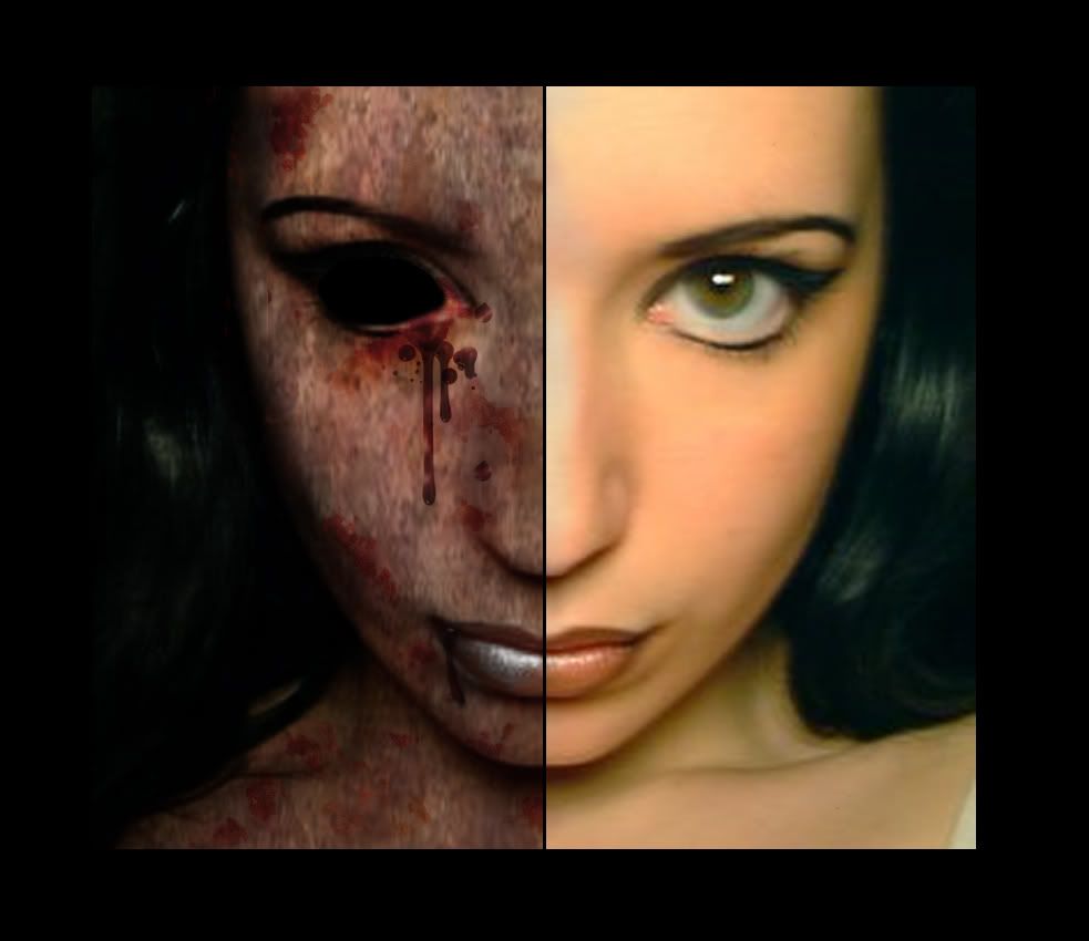
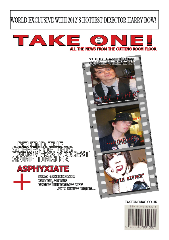
 My poster helps to promote the film by using an image of one of our main characters. The gaze is directly at the audience allowing them to be addressed. I have then layered an image of water over this introducing a main theme within the film. I used the name of the film, conventionally, and used different colours within the font to highlight the word 'hate', a genre specific theme. The information for producers, music, actors, director, release date and website are all included in the billing block. My film magazine front cover uses words like 'PLUS!' and exclamation marks to catch the reader's attention. I have made the biggest thing on my magazine cover, the film name, drawing people towards it. I have used nearly the same image as on my poster to again address the audience and create a sense of uniformity within my portfolio. The phrase "SUMMERS BIGGEST SPINE TINGLER!" is across the image to promote the film. It contains alliteration and a well-known phrase to attract the audience. The word 'BIGGEST' then makes the film seem like it would be good to watch.
                    The 3 texts I have constructed work well together as they have a sense of uniformity due to the similar imagery throughout such as the black hood and the water, which then generate interest through giving the audience ideas about the film. As well as this,  have used a colour scheme of red, white and black which is specific to the horror genre, and continuous throughout the titles in the trailer, my magazine front cover colour scheme and the font on my poster. The information included also match up, this contains the stars names, which could make the audience more likely to see the film becoming a USP(unique selling point) and the release date, telling the audience when they can view our film.

Technologies

Me and my group used a number of technologies while producing our promotional portfolios, including the internet, where we researched our chosen genre using Wikipedia and search engines such as Google, we also used YouTube to watch and take ideas from other trailers. We downloaded the music we used online and regularly updated our process using Blogspot.


The images I used on my front cover and poster were captured using my own digital camera and then edited using Photoshop and Paintshop Pro. I used Photoshop to layer my image of water onto my image of our character then lowered the opacity of it to create the effect of a reflection, I then used Paintshop pro to edit the shadowing, creating a darker, more eerie image, and size. 


The editing software I used for my magazine front cover and poster was Adobe InDesign, this allowed me to layer images together and put in fonts of different colours and angles. 


Any filming we needed to do was done using a video camera and a tripod, the tripod allowed us to keep a steady shot and vary our angle. We edited our shots in Adobe Premier Elements, which gave us the opportunity to cut footage, write titles and introduce transitions and filters such as black and white or sepia.


Focus Group Questionnaire results.

We asked 6 people to be a part of our focus group and answer a questionnaire on our trailer:

1. All 6 of our group thought that our trailer was from the horror genre.

2. The majority of our group said that our trailer targeted both gender but one thought it specifically targeted males.

3. Three people said our target audience was 15-24, while two guessed at 13-19 and the last said 16-25.

4. The most popular key images picked out of our trailer were, the black hoods, the girl drowning and the girl being dragged across the floor.

5. Everyone in the group could describe the basic plot.

6. There were mixed opinions on who the protagonist/killer featured in our trailer was.

7. The most commonly felt emotions within the group while watching our trailer were anxiety and fear.

8. The killer was not discovered by most, suggesting that our trailer didn't give too much away but there was a comment made that it may contain too many death scenes.

9. Everyone said they would see our film after viewing our trailer.

10. Everyone said that our soundtrack worked well with our shots.

Saturday 28 April 2012

Questionnaire for Focus Group


1. What genre do you believe the trailer is?

  • Comedy
  • Horror
  • Psychological Thriller
  • Action
  • Sci- Fi


2. Which gender does the trailer target at?

  • Female
  • Male
  • Both


3. What age group do you believe the target audience is for the trailer?

  • 13-19
  • 16-23
  • 15-24
  • 18-53


4. What 3 images stood out the most for you?


5. Can you reveal the basic plot of the story?


6. Who do you believe the protagonist is? (Killer/main character)


7. What are your emotions after watching the trailer?


8. Do you think the trailer reveals too much?


9. Would you go see the film in the cinema?


10. Do you think the soundtrack goes well with the shots in the trailer?

Analysis of Film Poster

The film's title is "Asphyxiate" which suggests cutting off air, possibly through drowning or suffocating. This could be either physical or psychological. The main image is a female character with her face partially obstructed by a black hood, she is reflected in water. It is multi-layered. It creates a code of enigma as to who this character is, why her face is covered and what is the significance of the water? The poster employs iconography of the horror genre, using a black and red colour scheme and a shadowy image. The film's stars are in the billing block but are however not prominent. The only star who is shown is the female and she is shown in character, her face is partly obscured and she has a blank expression but is addressing the audience with her glance. She is in a black hood. The tagline used on the poster is "The past is about to surface" this could suggest something coming back up in people's knowledge, someone coming back from the past or it could also link to the water, as in something surfacing from the depths. 
                 The credits on the poster include the names of stars, producer, director, musicians, SFX man, editors and writers. The credits could help sell the film to the audience as the producer is labeled as "exclusive". The film is offering the audience fear, and a sense of mystery through the image but also a level of exclusivity by using such a producer. The target audience appears to be mostly young females as this is who the character portrays and the majority of the stars names are female. 
                The film's USP could be that it has a "exclusive" producer but it could also be to do with the plot, in that it carries the ideas of loss of air, smothering allowing the audience to possibly feel totally consumed in the film.


Friday 27 April 2012

Final Drafts of Film Poster and Magazine Front Cover


Here I have changed the banner to red to make it fit more with the rest of the colour scheme and introduced my main image, I have been careful not to obscure this image with the sell lines I have used. I have also straightened the film reel as when I used the slanted version, it caused the actual image to distort. There is an extra sell line in the top left hand corner to fill any blank space.

On my poster, I have played about with different fonts for the billing block until I found a more appropriate/readable one. I then straightened the billing block and downsized the website but left it in white to emphasise it's importance. I have included a new slogan as, I felt the original was too lengthy, I have then feathered this to make it appear part of the reflection, I think this is very effective and helps to link the image with the tagline.

Tuesday 24 April 2012

Film Magazine Cover 2nd Draft

I have added my subsidiary images and now just have to slot in my main image and possible a badge on the left side to fill space.


Tuesday 20 March 2012

1st Draft of Film Magazine

The boxes of the film reel will be filled with subsidiary images of movie villains with a sell-line of their name underneath. My main image will be on the left, partially obscuring the masthead, and covered with a sell line introducing the film and subsidiary sell lines of other film names next to a plus +. I mage change my tagline, as I am unsure of the colour scheme. I have also decided to maybe include a sell line in a circle next to the main image as my hand-drawn draft looked too spacey without it.

Monday 19 March 2012

Film magazine front cover.

I have decided to use this magazine front cover as a template and create something similar for my own project. However, I am going to try and create an effect of a film-reel to put my subsidiary images into in the place of  "HEROES OF 2010!" I may also leave out the circle next to his face, as well as the image by the banner line, as I feel 8sell lines could be enough and the circle might cause the cover to look cluttered. My masthead will also be covered as it gives the illusion of an established brand.

Thursday 15 March 2012

Film Poster With Tagline

Finished Film Posters

1. I have used the black and white image and changed the font as I thought it could come of as cheesey, however I have edited the image so that it is darker. I have also fixed the billing block and slogan(which I have feathered  to make it look like it also part of the reflection) I may edit this as it showed up more in Adobe InDesign but unfortuneately is only partially visible here, the idea can be seen in no.2
 
2. Here I have kept the font and used a colour image. But I have filled in the slogan and the billing blog similarly to that in no.1. I have changed the colour of the website as it was the only white font on the page, however, it was difficult to see the black on the black and white image. Here you can see how the feathering of the slogan makes it look part of the reflection.

Out of the 2 projects I have created, no.1(hopefully more so after possibly editing the slogan) is my favourite as the font used is a little more professional and the image looks creepier in black and white, my favourite part of the poster is how I hav feathered the slogan. I have also followed conventions such as the colour scheme of red, white and black and using an image-lead design. I feel my poster is not too cluttered but also does not leave too much space.

Tuesday 13 March 2012

Film poster drafts.


I have done a colour and a black and white copy of my poster, I now have to decide which image to use, insert the slogan and billing block names and possibly change the red of these to a darker shade to match the font of the title.

Film poster without picture.

I now just have to put in my image and insert the slogan and billing block names.

Wednesday 7 March 2012

First 3 drafts of film poster(drawing and short analysis)

1.


2.

3.

The film's title is "Asphyxiate", it suggest cutting off air, possibly through drowning, strangling or smothering. This smothering could be physical or emotional. The main image is of a lake with a reflection of an ambiguous person with their face partially obscured by a hood, it is multi-layered. The expression is very angry, which raises questions such as who is this person? Why are they angry? Why are they wearing the hood? etc.
           The poster employs the iconic colour scheme of black and red for the horror genre. The majority of the title is written in white however there are 4 letters in red, highlighting the word 'hate' which is another common theme within this genre. The film's 3 main stars are named in the billing block (which is also in red) along with the producer, picture companies, website and release date.
            The stars are the USP as their names are in capital letters and the target audience can now include older/more intellectual people who are likely to understand the title and draw in younger people, by presenting them with an understandable word within this. In the image a young female is represented.
             Between draft 1 and 2 I was advised to cut some of the mise-en-scene in the image, which I have done, and change the font. The font in 2 is simple bubble writing but draft 3 includes an example of the font I liked in my previous blog post. I have also toyed around with different colours within the title and expressions for the female character, finally removing the covering of her face as the shots we have filmed do not include this yet the hood still obscures the face.

Tuesday 6 March 2012

Possible fonts for film poster

I like this font as it is simple and easy to read yet still has a horror feel to it.
I like this font as it has an authentic look and almost seems to be handwritten.
I don't like this font as much as the others but decided to try it as it was called 'asphyxiate' :)
I liked this font best overall as it fits the horror genre but also goes well with our plot as it could look as if it is dripping possibly with water, linking to the lake.

Friday 2 March 2012

Filming.

My group are currently around half way through filming our trailer, and just have to organise when we can film the scenes near the lake. We also have to edit what we have already shot. Unfortuneately I have missed two filming sessions, however I have also been to two and have filmed some of the footage we are using.

Sunday 8 January 2012

Analysis of film posters

 
The title of this film is 'Black Christmas' this gives the impression that the film is set around the time of Christmas. The colour black however is not usually associated with Christmas and has connotations of darkness and gloom. The main image consists of a face, with a scared expression, wrapped in Christmas tree lights. It raises the question of, is this a scene out of the film? How does this fit into the rest of the story? It does not necessarily reinforce a central enigma however it does reinforce stereotypical elements of the horror genre. It does this through the iconography of a victim and the scared expression on their face. Another stereotypical element of the horror film poster is the colour scheme of black and red. There are no stars pictured, but they are mentioned in the billing card. The movie's tagline is "This holiday season, the slay ride begins." this contains a double meaning as the idea of a 'sleigh'ride is related to Christmas, yet spelling it as 'slay' introduces the theme of murder. The film offers the audience a new way to look at Christmas and a change to purge any feelings of fear. The target audience appears to be both male and female of about 20-30. The thing that gives this film a difference is the time it is set at. Christmas is usually associated with joy and goodwill, however here, we are asked to look at in a more negative, frightening way.

The films title "The Ring" does not suggest a lot about the film, other than it contains a ring as a central element.The main image is a simple picture constructed of just a ring of what appears to be light, with the film title inside.   It reinforces the central element of the ring and helps to raise questions of what significance it holds. This poster also uses the stereotypical colour of black to show the horror genre. There are no stars pictured or named. The movie's tagline is "Before you die, you see...(the ring)" It  gives just about as much away about the film as the title and imagery, however we now know that people will see  'the ring' before they die, it also directly addresses the audience using the word 'you'. The poster is offering you the chance to find out more about 'the ring' and why people may see it before they die.

The film's title is "30 Days of Night" which suggest themes of darkness, night and mystery. The main image is a vampire looking upwards with it's mouth open. Vampires stereotypically feature in films of the horror genre, it also stays within the general colour scheme of black, white and red. The only star of the film shown, is the vampire, however he is in character and behind an effect and so is unrecognisable as an actor. He is positioned towards the top of the poster above the title. This poster does not show a tag-line but it does tell the audience that it is "based on the graphic novel". Therefore, the audience are being offered a visual, moving image version of the graphic novel. The film is also being released in October, which could be considered stereotypical of a horror film as Halloween takes place in October.

This film has the title "The Uninvited" which has connotations of something unwanted being around or just showing up. The main image is a distorted image of someone looking in from a window, this reinforces the idea of the title as they may have been shunned to the outside. The poster also uses the black and white colour scheme to create a stereotypical horror imagery. The person shown may or may not be one of the stars but is, however not in focus so we can not tell, this person is dressed in a simple grey T-shirt, maybe to allow an element of anonymity. The movie's tagline is "fear moves in" which again reinforces the horror movie stereotype as fear is a feeling often associated with these films. The words "moving in" also create a sense of being followed or almost cornered. The poster tells us that the film is "from the producers of 'the ring' and 'disturbia' which again puts it in the horror genre as it is linked with these two films. This could also be a unique selling point for the film as audiences of these two films will become interested. The film offers audiences a change to experience 'fear moving in' and find out what 'The Uninvited' is.


This film is called "The Exorcism of Emily Rose" which suggests a character of Emily Rose, and the fact that she is being exorcised. The main image is a young girl(presumably Emily Rose) with a distressed expression on her face, clutching a crucifix. The distress on her face allows us to place this film in the horror genre as this is a feeling commonly linked with such films. However we could also argue that this film is a psychological thriller as it contains themes of a supernatural nature, e.g. exorcism. The colour scheme is also black, white and red, hinting at the horror genre. The only star shown is the young girl but we are not told who the actress is, she is placed at the top of the poster, just above the title. She is in profile with her face partially obscured by her hair. She is dressed in quite an old fashioned white dress suggesting that the film is set in the past. There is no tagline but the audience is told that the film is "based on a true story" this could be said to make it more frightening as it is a real fear. This could be the unique selling point of the film, the audience are being offered the experience of this true story.