
Tuesday, 27 March 2012
Tuesday, 20 March 2012
1st Draft of Film Magazine

Monday, 19 March 2012
Film magazine front cover.
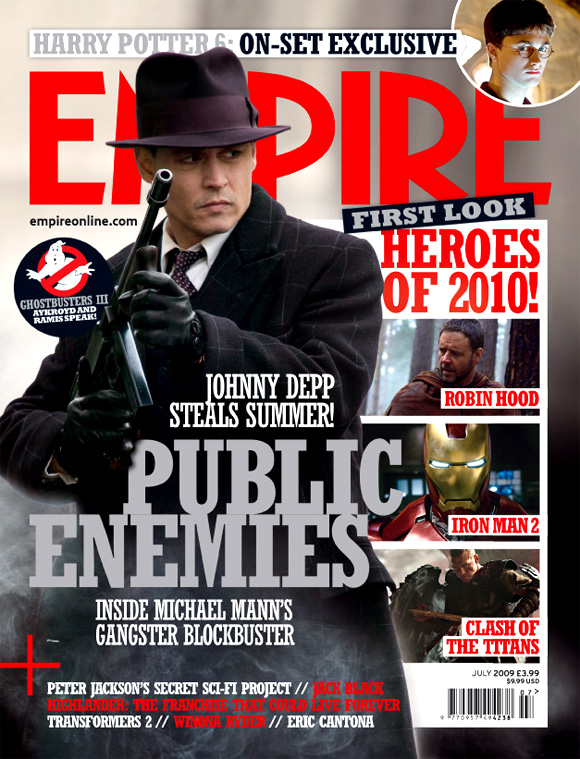
I have decided to use this magazine front cover as a template and create something similar for my own project. However, I am going to try and create an effect of a film-reel to put my subsidiary images into in the place of "HEROES OF 2010!" I may also leave out the circle next to his face, as well as the image by the banner line, as I feel 8sell lines could be enough and the circle might cause the cover to look cluttered. My masthead will also be covered as it gives the illusion of an established brand.
Thursday, 15 March 2012

Finished Film Posters
 1. I have used the black and white image and changed the font as I thought it could come of as cheesey, however I have edited the image so that it is darker. I have also fixed the billing block and slogan(which I have feathered to make it look like it also part of the reflection) I may edit this as it showed up more in Adobe InDesign but unfortuneately is only partially visible here, the idea can be seen in no.2
2. Here I have kept the font and used a colour image. But I have filled in the slogan and the billing blog similarly to that in no.1. I have changed the colour of the website as it was the only white font on the page, however, it was difficult to see the black on the black and white image. Here you can see how the feathering of the slogan makes it look part of the reflection.
Out of the 2 projects I have created, no.1(hopefully more so after possibly editing the slogan) is my favourite as the font used is a little more professional and the image looks creepier in black and white, my favourite part of the poster is how I hav feathered the slogan. I have also followed conventions such as the colour scheme of red, white and black and using an image-lead design. I feel my poster is not too cluttered but also does not leave too much space.
Tuesday, 13 March 2012
Film poster drafts.


Film poster without picture.
 I now just have to put in my image and insert the slogan and billing block names.
Thursday, 8 March 2012

Wednesday, 7 March 2012
First 3 drafts of film poster(drawing and short analysis)
1.

2.

3.

The film's title is "Asphyxiate", it suggest cutting off air, possibly through drowning, strangling or smothering. This smothering could be physical or emotional. The main image is of a lake with a reflection of an ambiguous person with their face partially obscured by a hood, it is multi-layered. The expression is very angry, which raises questions such as who is this person? Why are they angry? Why are they wearing the hood? etc.
The poster employs the iconic colour scheme of black and red for the horror genre. The majority of the title is written in white however there are 4 letters in red, highlighting the word 'hate' which is another common theme within this genre. The film's 3 main stars are named in the billing block (which is also in red) along with the producer, picture companies, website and release date.
The stars are the USP as their names are in capital letters and the target audience can now include older/more intellectual people who are likely to understand the title and draw in younger people, by presenting them with an understandable word within this. In the image a young female is represented.
Between draft 1 and 2 I was advised to cut some of the mise-en-scene in the image, which I have done, and change the font. The font in 2 is simple bubble writing but draft 3 includes an example of the font I liked in my previous blog post. I have also toyed around with different colours within the title and expressions for the female character, finally removing the covering of her face as the shots we have filmed do not include this yet the hood still obscures the face.
Tuesday, 6 March 2012
Possible fonts for film poster
I like this font as it is simple and easy to read yet still has a horror feel to it.
I like this font as it has an authentic look and almost seems to be handwritten.

I don't like this font as much as the others but decided to try it as it was called 'asphyxiate' :)

I liked this font best overall as it fits the horror genre but also goes well with our plot as it could look as if it is dripping possibly with water, linking to the lake.
Friday, 2 March 2012
Filming.
My group are currently around half way through filming our trailer, and just have to organise when we can film the scenes near the lake. We also have to edit what we have already shot. Unfortuneately I have missed two filming sessions, however I have also been to two and have filmed some of the footage we are using.
Subscribe to:
Comments (Atom)