
Tuesday, 20 March 2012
1st Draft of Film Magazine
Monday, 19 March 2012
Film magazine front cover.
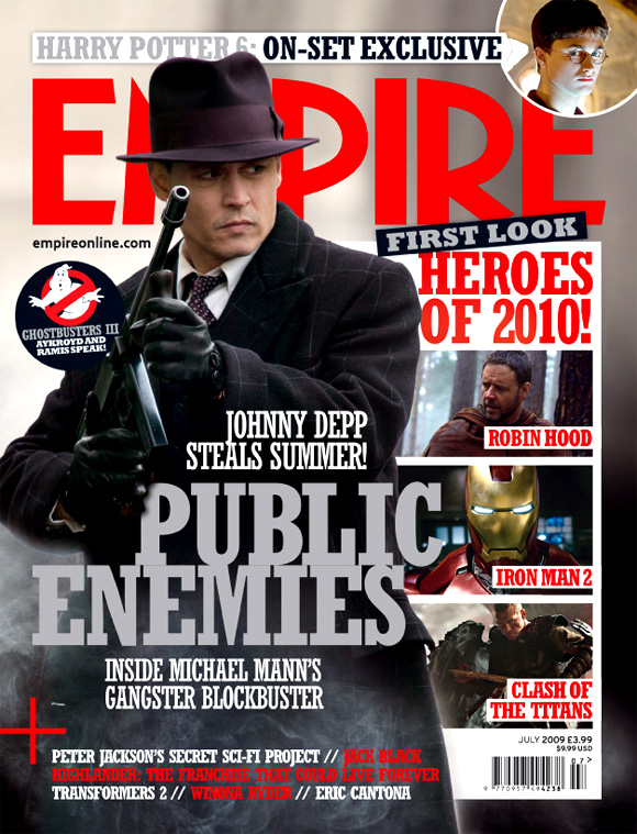
I have decided to use this magazine front cover as a template and create something similar for my own project. However, I am going to try and create an effect of a film-reel to put my subsidiary images into in the place of "HEROES OF 2010!" I may also leave out the circle next to his face, as well as the image by the banner line, as I feel 8sell lines could be enough and the circle might cause the cover to look cluttered. My masthead will also be covered as it gives the illusion of an established brand.
Thursday, 15 March 2012

Finished Film Posters
 1. I have used the black and white image and changed the font as I thought it could come of as cheesey, however I have edited the image so that it is darker. I have also fixed the billing block and slogan(which I have feathered to make it look like it also part of the reflection) I may edit this as it showed up more in Adobe InDesign but unfortuneately is only partially visible here, the idea can be seen in no.2
2. Here I have kept the font and used a colour image. But I have filled in the slogan and the billing blog similarly to that in no.1. I have changed the colour of the website as it was the only white font on the page, however, it was difficult to see the black on the black and white image. Here you can see how the feathering of the slogan makes it look part of the reflection.
Out of the 2 projects I have created, no.1(hopefully more so after possibly editing the slogan) is my favourite as the font used is a little more professional and the image looks creepier in black and white, my favourite part of the poster is how I hav feathered the slogan. I have also followed conventions such as the colour scheme of red, white and black and using an image-lead design. I feel my poster is not too cluttered but also does not leave too much space.
Tuesday, 13 March 2012
Film poster drafts.


Film poster without picture.
 I now just have to put in my image and insert the slogan and billing block names.
Thursday, 8 March 2012

Subscribe to:
Posts (Atom)