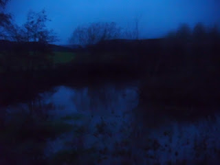
The first part of the animatic, is in chronological order which, along with the titles, helps to set up the background story to the film synopsis, however, the second part is not necessarily in chronological order but more in an order that builds up tension with fast-paced editing as the action becomes more and more exciting. The titles again, also go along with this. There is also a title near the start of the trailer which fades to black and the screen stays black for 2-3seconds while a high-pitched noise is heard creating tension.
Looking at our original storyboard, we decided to do 3 shoots and capture all images in each setting at the same time. Luckily, none of our settings needed to appear both in day time and night time and we were fast enough so as to not obstruct the time needing to be shown in the images, so we only had to visit each once.
We only used two main locations which were next to each other as our whole synopsis centres around the idea of the lake, and the majority of the action takes place either at this lake or in the forest next to it. The main prop in our synopsis is the mask, however unfortunately we could not get hold of this mask at the time of the photos being taken and so were unable to take shots including this prop. We also used props such as a car and a tent, to represent the idea of the journey and camping in the forest. We chose our actors on who, matching our character descriptions, was available at the time of shooting and was willing to take part.
During the storyboarding process, my group made quite a few changes to the initial plot but once we had completely decided on the plot we thought would work best, we decided not to make any alterations as, not only were we relatively happy with the storyline we had acheived but we did not really have time to make changes. However we did decide to simply show the boy being pushed then the next shot, show a splash in the lake, this was to represent the boy beng pushed in without actually having to show it.
We placed the shots into the editing software and chose how long each shot would last by lengthing or shortening it on the timeline. We then took the transitions and titles available and edited them in to fit our sequence. We put music over our piece finally, using just one continual piece as it seemed to fit our animatic. We chose our shot lengths on how important the shot would be to the storyline, for example an establishing shot of the lake would be longer than others as it creates the baclkground to the story. We also took into consideration, the pace as a mood creater, as we used short sharp transitions when most of the action was happening to create excitement.
Our transitions were mostly fade to black or fade to white as these create quite an eerie atmosphere and are also stereotypical of horror movie trailers. We wanted to use stereotypical elements as it helps to reinforce the genre and therefore emphasise the mood and atmosphere of the trailer.
The titles we used were as follows: "12 months later" "the lake is revisited", these two titles give some background to the story. We also included titles such as "1, 2, Eddie's coming for you." as a stereotypically horror reminiscent title, creating tension at the promise of something happening. The word 'you' also helps to engage and involve the audience. The font we used was chosen as it created an eerie feel.
The soundtrack we chose was named "Stagnant chill" and was chosen as it seemed to fit our edited animatic perfectly. However, we have since taken feedback into consideration and decided to apply some more upbeat music where the happier scene takes place. The music currently creates a very creepy atmosphere which fits well with the majority of the trailer but not the happier scene. Our animatic helps to appeal to our target audience as it features characters of around the same age and a storyline that would somewhat appeal to that age group, going camping as a group. In my opinion, we need to change our music track for the reasons in the paragraph above, also I think our trailer would work better if we used more action shots that feature for a shorter time to create a more 'cat and mouse' kind of feeling. We also need to try and connect the two mise-en-scenes of the forest and the lake more. We also need to add in the diegetic sound.
The fourth image I chose was, the image of the shadow inside the tent, as it allows the audience to almost associate the tent with safety but also leaves a code of enigma in that of questions such as who is in the tent? why are they in tent? what are they doing? And my final key image is another shot of the lake, but this time looking over, almost as if something will rise from it, hence the name "Risen." this creates tension and excitement for what will happen.
I typed up the original plot, although it was not used, put forward ideas for storyboarding and helped in the editing process, such as choosing music to fit the images. However I was not available for the dates when the images were taken. I also came up with the name of the product as "Risen" as it signifies both rising from the dead and rising from the lake.
1.

2.


